visual-literacy.org: Engineering
Topic outline
-
Welcome to Demo Module: VizInfo
Teachers: Riccardo Mazza, Dominique Brodbeck, Michele Lanza & Richard WettelGeneral information & tools
In this module you will get an introduction to the main concepts and techniques on Information Visualization (infovis). You will see how a huge amount of data can be represented in a visual format that allows people to gain insights that might lead to significant discoveries.
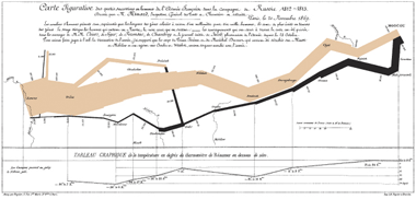
In particular, you will learn:- how to use graphics to illustrate data and relationships between data elements
- the basic principles of infovis
- the different usage of infovis (presentation, explorative analysis, confirmative analysis)
- strategies and techniques that help us transform large multidimensional datasets into structures that are conducive to visualization.
- how different data structures (plain, hierarchical, network) can be visualized
- how to create your own visualization solutions for concreete practical problems. You will have the opportunity to come up with your own visualization ideas and apply them to some interesting problems.
- concepts of software visualization which will facilitate both the human understanding and effective use of computer software
-
from Module 3: Information Visualization
-
from Module 6: Multidimensional Visualization
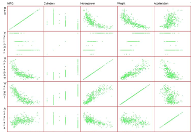
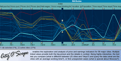
The problem with multi-dimensional data is that we only have three spatial dimensions available onto which to map the attributes. In practice we are even limited to two dimensions, as three dimensional visualization is tricky and usually only works well for data that has an intrinsic spatial structure. One common strategy to deal with that problem is parallelization. -
from Module 6: Multidimensional Visualization

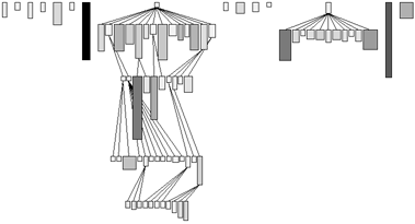
Hierarchies are a common strategy to structure large amounts of information into nested manageable chunks. We find them everywhere, for example in taxonomies, tables of contents, file directories, or corporate organization charts.
In this section we will first have a look at different ways to viually represent hierarchies.
This is followed by a case study. We will look at a visualization method called the Parallel Coordinate Tree that combines multidimensional analysis with a tree structure representation. Distortion-oriented focus+context techniques are used to facilitate interaction with the visualization. It is a design study of a commercial application that was built, using this method to analyze and communicate results from large-scale customer satisfaction surveys.
Finally, the exercise puts things back into the big picture.
-
From Module 9: Data Visualization

In the basic modules we have learned about the fundamental principles and techniques of information visualization. In the application modules we have then seen how these can be integrated and applied to real world problems.
The goal of this module is now to learn how to create your own visualization solutions for concrete practical problems. You will have the opportunity to come up with your own visualization ideas and apply them to some interesting problems. Some interesting data sets that you could use as a starting point are provided, but you can also identify a complex dataset yourself. Maybe from your professional context, or something you find on the Internet.
The work will be performed in groups and the results presented in class, to emphasize the social and communicative aspects of visualization.The Task
The task consists of the following steps:
- Look for an interesting data set
- Formulate the questions that you want to have answered about this data
- Think about what kind of visualization and interaction techniques are needed to provide these answers
- Develop the visualization by either using existing tools, or by creating a mock-up
- Create a presentation to communicate your findings
- Upload it to the VizHall
- Rate and discuss the work of your peers
Criteria for the data set
The dataset must be reasonably complex, i.e. it should not be possible to answer your questions with a few simple Excel manipulations. It can also consist partly or even wholy of non-numerical data. If in doubt, then plase ask the instructor for an assessment.
-
From Module 9: Data Visualization

The following links contain a (non-comprehensive) collection of sources for interesting data sets that might inspire you:
Data Sources
- Bundesamt für Statistik (Swiss Federal Statistical Office): Data about Switzerland.
- Statistisches Amt des Kantons Zürich (Statistics Office of the Canton of Zürich, German only): Good source of statistics data about the greater Zürich area.
- UBS Wealth Management Research: Economic research data, among them the "Prices and Earnings around the Globe" survey.
- Many Eyes: A collection of data contributed by users of the web site
- Encyclopedia Titanica: Interesting data about the passengers on the Titanic.
- CIA World Factbook: A wealth of data about all the countries in the world.
Further resources:
-
From Module 9: Data Visualization

The following links contain a (non-comprehensive) collection of freely available tools that might inspire you:
- Mondrian: Mondrian is a general purpose statistical data-visualization system written in JAVA. It features outstanding visualization techniques for Categorical Data, Geographical Data and LARGE Data.
- Visulab: VisuLab (short for visualisation laboratory) is an experimental software package for the comparative visualisation of multivariate data. The latest Release of this software is designed as an Add-In to work in Microsoft Excel 2000, XP, 2003 and up.
Further resources:


