Development: Developing a Strategy
Developing a Strategy
Visualization can be used to develop a new strategy. This can happen with sketches or diagrammatic representations such as the synergy map.
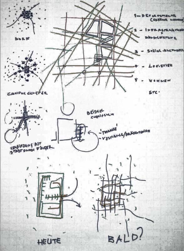
The map below illustrates one of a series of sketches that have been used in a mutual planning process. In the so called future lab around 100 persons were designing and mapping how the future implemented Science City should look like. Based on these sketches it was helpful to mutually develop the vision which then helped to derive the strategy.
The next example helps as cognitive aid in a small team:
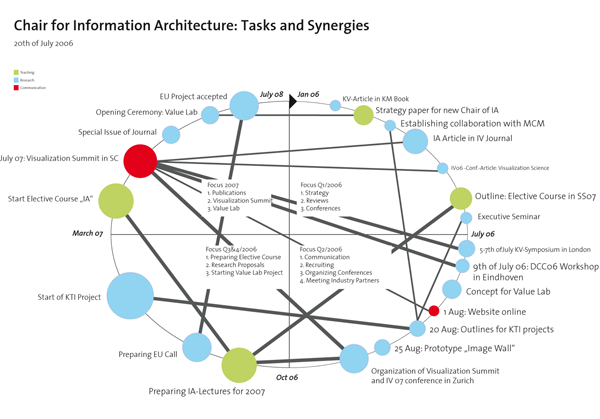
Situation: The new chair for information architecture had to be designed and built up. To do so, a series of small tasks needed to be man-aged in a small team. Problem: Because of a general lack of time and many very small tasks a project plan would have been an overkill. A more simple visualization was needed. Secondly, the main question was how to illustrate the interrelationships of the tasks, because it was important to al-ways keep the mid-term perspective in mind and how we reach it. Solu-tion: In Figure 17 we can see the so called Synergy Map. The synergy map was invented by Martin Eppler as a tool for individuals, who rank and assess their personal goals and see whether they are conntected or not, which give a clue about the efficiency. We used the same technique to map the strategic tasks. The circle represents the time and starts at twelve. Each quarter represents a time periode. Inside the four quarters we wrote down the main goals of the time periode. Each task is represented with a circle. The size represents the amount of time that is necessary to finish this task. The colors give a clue whether it is a research, teaching, or exter-nal communication task. The lines represents connection among the tasks. You can see for example that the Visualization Summit is highly con-nected with a series of tasks in the first and second quarter, which means that they contribute a lot to the successful event. The chart was drawn by hand in Adobe Illustrator CS. It was updated on a monthly base which needed around 2 hours of time. The visualization was then presented and discussed in the monthly strategy meeting and printed as a poster. Evalua-tion: The visualization was very powerful for communication and coordi-nation. It allowed to always keep the essence in mind and it pushed the whole team to monthly rethink the strategy and its implementation. It that way the visualization de-mystified the strategic planning workshops and allowed to better link strategy definition and strategy implementation. The visualization was very easy to modify and mapped quite a large amount of relelvant knowledge. It was also used to explain different persons the strat-egy of the new chair. Conclusion: The Synergy Map proved to be very ef-fective and can be highly recommended for small teams, not only for the proposed situation, but also in complex projects with highly interconnected tasks.